“Sondagem das Sondagens”: Where all polls come together
“Sondagem das Sondagens”: Where all polls come together is an aggregator of, excuse the redundancy, polls. This means that it brings together political opinion studies carried out by polling firms or higher education institutions on legislative issues. The project has existed under the umbrella of Renascença since 2015 but, with the 2024 elections, the team has renewed its structure, image and methodology.
During this process, Renascença had the support of Luís Aguiar-Conraria - researcher, professor and current president of the School of Economics and Management at the University of Minho - and used the method adopted by the POPSTAR project (Public Opinion and Sentiment Tracking, Analysis, and Research), then coordinated by Pedro Magalhães, political scientist and researcher.
Diogo Camilo: Originally from Tomar, Diogo earned a degree in Medicinal Chemistry from the University of Beira Interior, and it was in Covilhã that he changed course to Journalism. He spent four years at Sábado magazine developing a passion for data journalism, and since 2022, Renascença has been his laboratory.
João Pedro Quesado: All the way from the very north of Portugal, João became a journalist in 2022, after graduating from Minho University. His main focus is mobility and transportation, but all matters are of interest. The main one being F1.
Salomé Esteves: Besides being on the DataVis Lisboa team, she is a data and visual journalist. But, because it’s not natural for her to do just one thing, she also teaches Data Visualization and Infographics at the Lisbon School of Architecture. Salomé also finished her Ph.D. in 2023.
1. Who do you imagine as the target audience for this project?
It will primarily be people interested in politics and polls. Since this is a topic that raises some distrust. There are different results depending on the different polling companies, even if published at the same time. We also aim to demystify some of the common mistakes that lead to errors when reading poll results. And, although it is a somewhat niche subject, it gathers many enthusiasts.
2. Did you do any data transformation or preprocessing to allow for more effective visualization? Can you detail these processes?
We processed the data according to a distribution of undecided voters purely proportional to the voting intentions obtained by the parties. We wanted to eliminate potential differences in methods between polling companies that, in a model like ours, could introduce noise. However, data visualization was not a consideration at that stage.
3. Did you have difficulty accessing data? If so, how did you overcome it?
The redistribution of undecided voters to standardize the poll results was the biggest difficulty because not all polling companies do it in the same way. Another problem is updating the page daily, as new polls come out in various media outlets. Since the Media Regulatory Authority (ERC) only shares the results up to 15 days after the polls are released, we relied on the collaboration of the companies themselves and the publications that released the survey results to process the results.
4. What programming languages, libraries, or tools did you use to create the visualization? Can you detail some technical aspects of your project?
Our project has existed for several years but has been dormant since the 2022 legislative elections. This year, taking advantage of the capabilities of this new team, we opted to renew a large part of the process. The base of the page remains the same, but it was necessary to rethink how the data fed the charts. So, we decided to transform the old R script, which dated back to 2019, into a Python script. This way, we could facilitate data processing for a larger number of people since this language is easier to learn. At this point, we collaborated with Rita Marques Costa, whose insights were crucial. The charts themselves were also renewed. We used the billboard.js library, which had already been used by the initial team, and we edited the colors and interactions of the contents to increase the visualizations’ accessibility and usability. We know there are necessary changes, and we are working to improve some graphical aspects in the near future.
5. What discoveries has your data visualization revealed? Anything unexpected?
Given the nearly monthly publication of voting intention polls and how this data informs political and journalistic discourse, it is difficult to discover something unexpected when the data is all combined. But it is still interesting to look at the party lines on specific dates - such as early November 2023, when Operation Influencer (which led to the resignation of António Costa as prime-minister) became public - and see changes (or reinforcements) of trends that existed up until then.
6. What has been the feedback?
It was better than we expected. We saw and heard polling experts mentioning the project as the most reliable way to look at the surveys released as a whole, which was exactly what we intended. Throughout the weeks and the electoral campaign, there were more and more people referencing the project for how the parties were positioned, and the parallel articles that we wrote also helped explain some of the phenomena that were later observed on election day.
7. How do you imagine the project's evolution in the future?
One thing we wanted to do in this election but had to cut to improve page performance is to show more historical poll data – and combine that with important chronological milestones, such as government changes.
Another thing that might be on our minds is how to use the data to project a composition of the national parliament – which would require processing the raw data from the poll samples separately.
If you have any project you would like to see here, send us a comment, but remember: it must have been carried out in Portugal 🇵🇹
Special Report: Floods in Rio Grande do Sul
As you may know, the Brazilian state of Rio Grande do Sul is experiencing the worst floods in its history – a consequence of climate change. Consequently, various data visualization projects have emerged to communicate the scale of the tragedy. This month, we've selected a few that caught our attention:
1. Water up to here
By placing stickers with the text "Water up to here" around cities, the project raises awareness of the extreme consequences of the climate crisis.
2. Overall Size of Affected Municipalities
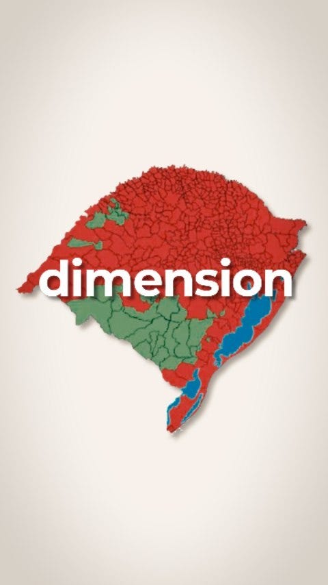
Filmmaker Marcelo Carôllo created videos illustrating the scale of the tragedy for those unfamiliar with the state. This work shows that, when adding up all the affected cities, the impacted territory is twice the size of Portugal!
3. Comparison between Porto Alegre and Lisboa & other cities
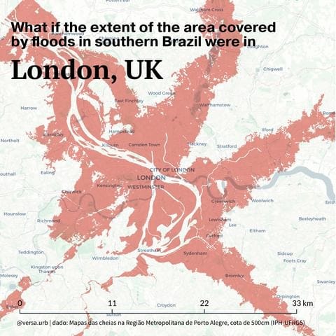
To illustrate the scale of the area affected by the floods (considering only the Metropolitan Region of Porto Alegre), the architecture and urban planning firm Versa overlaid the flood area onto the map of ten cities.
4. Income
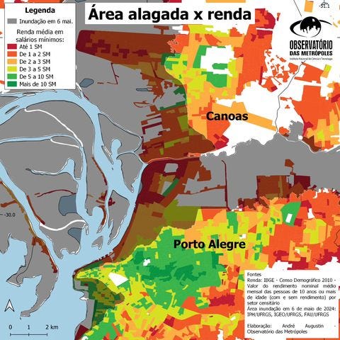
The Porto Alegre branch of the Metropolis Observatory cross-referenced the flooded areas with income data from the Demographic Census and found that the affected areas (Porto Alegre and the metropolitan region) are primarily populated by low-income communities.
DONATE AND HELP THOSE AFFECTED BY THE FLOODS
The Central Única das Favelas (CUFA) is coordinating a vast humanitarian operation in Rio Grande do Sul. Already, 20 thousand hygiene and cleaning kits, 20 thousand personal hygiene kits, 20 thousand liters of water, loads equivalent to 5 truckloads of food, 30 thousand bath kits, and 30 thousand mattresses have been delivered. International donations can be made via PayPal at doacoespaypal@cufa.org.br.
Accessibility and DataViz – Basic Structure of a Chart
Throughout these months, we'll be giving you small tips to make your visualizations more accessible.
(If you haven't seen the previous editions, start by reading a bit more about Accessibility and check out the past tips here).
This month, we want to focus on the basic structure of a chart and the importance of making our visualizations clear and self-sufficient. This means that anyone viewing a chart in isolation should have access to all the data necessary for its correct interpretation. Moreover, at a time when information sharing is so widespread, with images easily taken from articles or websites and posted on social media, these tips will be crucial to avoid misinformation:
Basic structure of a chart
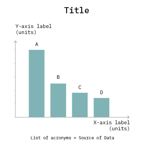
All charts should include, at a minimum: title, variables and units, legends, descriptions of acronyms used, data sources, and possibly an annotation. In Figure 1, you can see an example of a chart with all the information; however, depending on the design, the location and format of this information can change – what matters is that it is all there!
Clear and informative titles
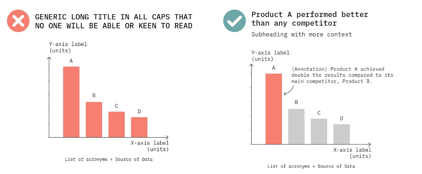
You can use the title to provide more information about the conclusions to be drawn from the chart. To facilitate reading, the title should not be too long or in uppercase. (see Fig. 2)
Certain audiences need more context
Depending on who you are communicating with, it will be necessary to adjust the level of detail provided. If the target audience for your chart consists of people who are not experts on the subject, you will need to provide a bit more context. This might include a subtitle and/or an annotation that points directly to the main conclusion or message of your chart (see Fig. 2).
Note: providing more context is not the same as complicating the information, which would be detrimental to an audience with little knowledge of the topic. There's nothing better than testing your charts beforehand with people who have never heard of the topic to understand what conclusions they draw from it.
If you enjoy our Pastel de Data, do not hesitate to share it so that others can also enjoy it. See you next month!
Your Data Visualization Lisboa Team,


