


PhDs – Portugal has Doctors: A Visualization of Academia Achievements in Portugal from 1970 to 2022
This is a project created by Pedro Silva, Pedro Martins and Penousal Machado from the Computational Design and Visualization Laboratory (CDV Lab) at the University of Coimbra. It is an interactive installation that visually represents doctoral theses carried out in Portugal between 1970 and 2022, also promoting discussion and greater recognition of these academic achievements.

1. What inspired you to create this data visualization project?
To give a brief context, this project is part of the doctoral thesis of one of the authors (Pedro Silva), supervised by the other ones. As a candidate for a PhD in data visualization, with a background in multimedia design, and with the other authors belonging to the community depicted in the project (PhDs in Portugal), it seemed natural and almost obligatory for us to use our knowledge to communicate the historical and current portrait of the academic research community in our country. We wanted to reveal what seems to be an undervalued or even forgotten number of achievements in the national scientific research landscape. We aim to reveal the considerable dimension of these qualified professionals, undervalued by our country, with a comprehensive and large-scale portrait, capable of raising awareness among the audience and giving the due recognition to the research community in Portugal.
2. How did you refine the initial idea to arrive at a more concrete concept of data visualization?
In a very simple way, a PhD thesis involves the production of new knowledge, validated by scientific publications and/or obtaining patents. This production of new contributions results in an incremental evolution of knowledge, leveraged by previously consolidated knowledge. A bit like the famous metaphor "Standing on the shoulders of giants". This concept of incremental contribution of knowledge with each new PhD was the conceptual basis for the representation of our data. Each new entry in the dataset (PhD) would be responsible for populating our canvas (here representing the space of knowledge) in a visually incremental way, where the starting point is, by default, the university to which it is associated.
3. Who do you imagine as the target audience for this project?
Well, considering that we want to disseminate and give proper recognition to the research community in Portugal, we like to think that this project would be particularly impactful if it reached the entities responsible for the conditions of academic careers in the country. Secondly, it should reach the entire Portuguese scientific community so that they are aware of the size of the community they are a part of and feel somehow acknowledged by the dissemination of such information. Lastly, but not least important, it should reach all those interested in this topic and in casual data visualization/data aesthetics.
4. Did you encounter any challenges in accessing the data? If so, how did you manage to overcome these challenges?
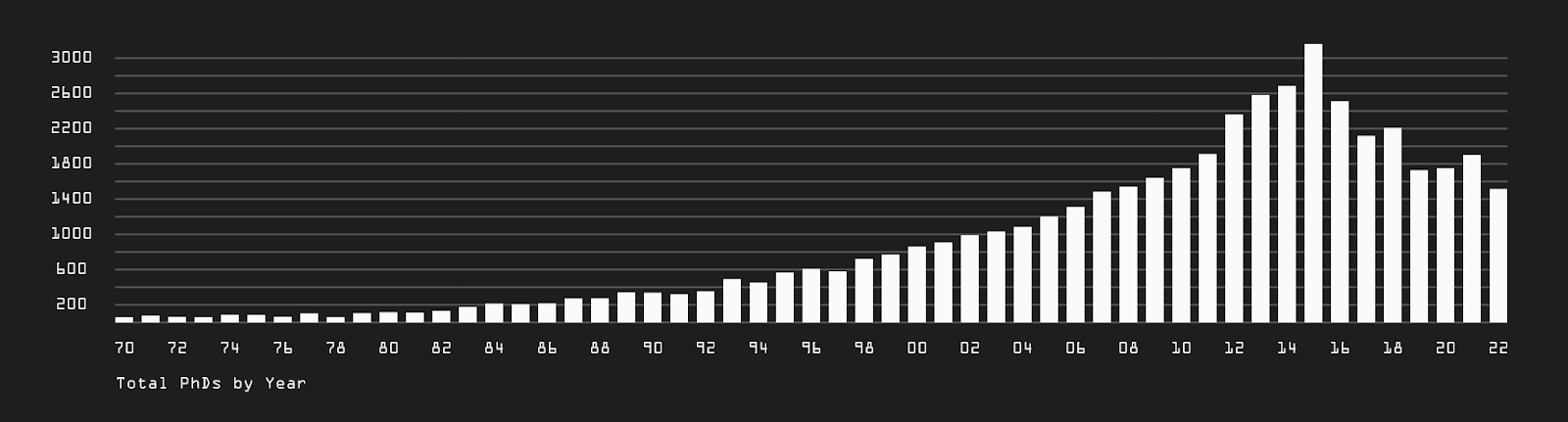
Yes and no. The data is public and is available on the RENATES platform, which is the result of an official collection of information by Portuguese higher education institutions and the Directorate General of Higher Education. However, the platform has a highly limiting restriction when it comes to downloading data, allowing only 200 entries to be downloaded at a time. In order to overcome this bottleneck, we contacted the organization via email to request access to all the data at once, in a single file. The obtained dataset contains 48,234 entries, representing all doctoral theses carried out in Portugal and abroad, but recognized in Portugal, between 1970 and 2022.
5. Did you make any data transformation or preprocessing to enable a more effective visualization? Can you detail these processes?
Yes. Like in almost all, if not all, visualization work the preprocessing of the data was necessary. Standardizing the typology of some fields, filtering or aggregating fields with registration errors, and also reducing the text of some fields for the purpose of optimizing the size of the dataset file.
6. What programming languages, libraries, or tools did you use to create the visualization? Can you provide some technical details?
The project was designed for the internet for accessibility reasons. It was entirely made in javascript combined with the library p5.js. The data loading is done locally through a json file. As a presentation support for the project, we used FeedNPlay, a video wall composed of 9 LCDs with a resolution of 9720 x 1920 pixels, resulting in an artifact of approximately 5 x 1 m, available in our department. Interaction with the installation is done using a wireless keyboard with an integrated trackpad.
7. What discoveries did this data visualization reveal? Anything unexpected?
Yes, certainly. To begin with, the number of scientific publications alone. Just thinking about the work behind each of these small visual elements makes one wonder about the investment and dedication of thousands of individuals over just over five decades. Furthermore, as expected, over the years, this number of contributions began to increase. What was more unexpected was to see a sharp decline in this number since 2015 (the same was pointed out by a university professor as something problematic), going precisely against the kind of reflections and insights we intended with this project. Why this sharp decrease in recent years? Perhaps people are increasingly looking at alternatives abroad due to better professional conditions... It was also good to note that there has always been a very similar distribution among genders and a surprising amount of foreign doctorates carried out, with a ratio of 1 to 6, dating back to the early recorded years.
8. How do you see the evolution of data visualization in your specific domains in the coming years?
We believe there are some important trends that can strongly dictate how we visualize and consume data. The democratization of data, which will allow wider access to different types of data, will require intuitive, customizable, accessible tools for a larger audience, while also raising significant ethical and moral challenges, namely in terms of privacy and data fairness or bias inherently embedded in Artificial Intelligence models, as they are nothing more than reflections of the humans who create them. This will therefore demand a greater need for transparency and understanding of the visualized data.
If you have any project you would like to see here, send us a comment, but remember: it must have been carried out in Portugal 🇵🇹

Diogo
Last month, the winners of the 2023 Information is Beautiful Awards were announced. The silver medal in the Science, Technology, and Health category was awarded to a marvelous piece by Reuters on sleep – that precious yet often overlooked activity. 'Journey into Sleep' combines scrollytelling and expressive illustrations and visualizations to guide us through a range of biological information about sleep, our circadian cycle, and the costs associated with a lack of well-rested hours.

Sara
More and more convinced of the benefits to society when we combine technology, science, and art, I have dedicated myself to exploring other means of expression. Inspired by the MIT Media Lab atmosphere, I have plans to dig deeper into the Processing programming language, created by Casey Reas and Ben Fry in this very building in 2001. If you are also interested in trying it, even with little or no experience in programming, I suggest the Domestika course 'Design com números: do data scraping ao DataViz' by Luiz Ludwig. I found it very well-structured and comprehensive. If afterwards you want to let your imagination soar, the sky is the limit (and by 'sky', I refer to the works of creatives like Zach Lieberman and Golan Levin). Very excited and curious about what 2024 will bring in terms of DataViz :)


Accessibility and DataViz – Color Blindness
Over the next few months, we will give you small tips on how to make your visualizations more accessible.
(If you haven't seen the previous editions, start by reading more about Accessibility and check out the past tips here).
We can't talk about color and accessibility without mentioning Color Blindness – the inability to see color or differences between colors. This issue, usually resulting from a defect in the visual cells that detect colors, is more prevalent in men, and affects about 5 to 8% of the population. Poor color choices can mean that a portion of your target audience won’t be able to read your visualization conveniently. What can you do to avoid this?
Be cautious with greens and reds together.
There are various types of color blindness, but the most common one affects the ability to discriminate between greens and reds. If you usually use green/red to indicate positive/negative, you can try using blue/red or use a more bluish shade of green.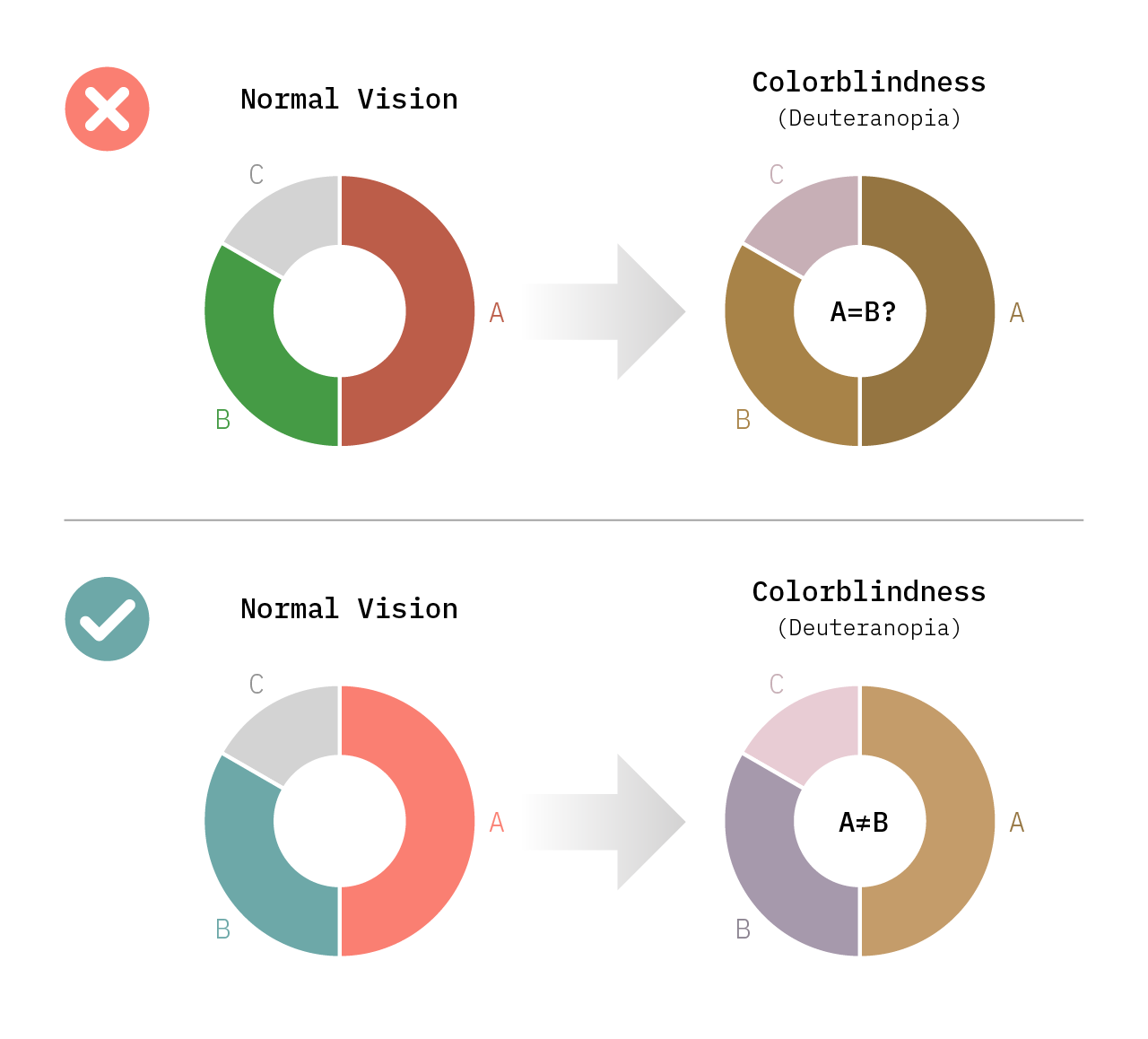
Always test your color palettes.
Regardless of the choices you make, you should always pre-test your visualization:You can use simulators like Coblis (website where you upload your image) or Color Oracle (a plugin that directly alters your monitor's color);
Or turn to more advanced tools like Adobe Color, which not only allow you to test for color blindness but also enable a more precise color selection using the color wheel.

Follow us over the next few months to learn more about Accessibility and Dataviz. Write to us if you have any questions or relevant experiences on this topic that you would like to share.
If you enjoy our Pastel de Data, do not hesitate to share it so that others can also enjoy it. See you next month and have a great start of 2024!
Your Data Visualization Lisboa Team,