

In this season, we are showcasing data visualization projects made in Portugal. If you have any suggestions, send them to us.

Rule 3-30-300 applied to Lisbon, by Manuel Banza (Data Scientist) and Bernardo Fernandes (Sociologist)
The "Rule 3-30-300 applied to Lisbon," created by Manuel Banza and Bernardo Fernandes, is the first article of Fazer Cidade and shows which buildings in Lisbon comply with the rule:
3 visible trees from the window
30% tree canopy coverage in the neighborhood
300 meters from a garden

1 - What inspired you to create this data visualization project?
This first article from Fazer Cidade about the 3-30-300 rule, which tells us whether the place where we live is prepared or not to face extreme heat, arises from our initial desire to write a book that addressed various problems of the urban territory related to proximity, collective spaces, and decision-making. Therefore, we started by schematizing some articles that we want to write in a more pragmatic way and, in the process, inviting more people to write with us. We focus especially on Lisbon, aiming to expose the challenges and propose public policies for collective space through data. We want to live in a more humane and balanced city in terms of the use of space that belongs to everyone, and we want this city to be more relational, light, and fun.
2 - How did you refine the initial idea to arrive at a more concrete concept of data visualization?
This article assumes that people have limited access to quality green spaces that provide shelter from the increasingly extreme heat. We wanted to address this in an interactive and appealing way, so we started researching concepts and crafting the story. In Fazer Cidade, one of the main concerns is ensuring that anyone (with basic knowledge of using a mobile phone or computer) can interact with the data we produce. We're tired of the monotony of static data, and in this case, people can explore different areas of the maps with various layers of information and input their address to see if their building meets the rule's requirements.
3 - Who did you imagine as the target audience for this project?
Naturally, we would like it to be for everyone, but it would be unrealistic to claim that. We know that not just anyone sits down at the computer and thinks "I really feel like reading a 25-minute article." This article is for people who have the time and resources to access information, consume news online, and are interested in urbanism and the environment. For those who have the desire to explore information beyond the article, we also offer many sources for consultation.
anyone who identifies
time to read the entire article
resources to access information in a relatively coded space
people who consume news online
4 - Did you encounter any challenges in accessing the data? If so, how did you manage to overcome these challenges?
Yes, we faced some difficulties in accessing data, however, Lisbon maintains a good open data foundation compared to other cities in Portugal. Although it has stagnated in incorporating new datasets in recent years and updating existing ones. As citizens, we should pay more attention to this issue because it is a great asset that we may lose in the future.
For the analysis of tree coverage, we relied on data produced through Copernicus satellite images, but with data from 2018. We also added more recent tree data that was not included in the Copernicus dataset (in 2018), which allowed us to have a closer approximation to reality.
However, when we look at other cities, especially neighboring Spain, we see that the information available in open data is much greater. Just look at the example of housing rent values provided by street by the Spanish INE, or the canopy data provided by the city of Barcelona.
5 - Did you make any data transformation or preprocessing to enable a more effective visualization? Can you detail these processes?
First, we obtained data from the following sources:
Buildings in Lisbon (Open Street Map)
Trees in Lisbon (Lisbon City Council)
Green spaces in Lisbon (Discord LPP)
Tree Cover Density, 2018 (Copernicus)
Street Tree Layer - STL, 2018 (Copernicus)
Taking into account the available data, in order to obtain results as close to reality as possible, we performed several transformations of the data. For data processing and rule calculation, the following steps were taken:
Buildings: First, all the buildings in Lisbon were imported from Open Street Map. Then, a centroid (the most central point of each building) was created for each polygon representing each building. This point will be used as the base to calculate the three rules (3, 30, 300).
Calculation of Rule 3: With this dataset, a radius of 50 meters was calculated from each centroid (the most central point of each building) and the number of trees within that radius.
Calculation of Rule 30: First, data from satellite images from Copernicus - Tree Cover Density 2018 and Street Tree Layer were imported. Then, the above-mentioned data, as well as the points of the trees in Lisbon used for rule 3, were intersected in order to identify trees that were not accounted for in the satellite images. In cases where this was found, a radius of 1.5 meters was assigned to each tree in order to simulate the tree canopy. The value of 1.5 meters is quite conservative but was chosen because it is difficult to predict, according to various consulted studies. We aimed for the average value of the most recent trees, especially because these are the trees implemented after 2018 that are not included in the satellite images. Finally, for each statistical section provided by INE, the green coverage area was calculated using the above-mentioned point data.
Calculation of Rule 300: The Green Spaces of Lisbon dataset was used. The updating of the dataset is carried out by the community of the "Lisboa Para Pessoas" Discord, and it was found that they had more recent gardens that were not included in the CML data. Only the layers that fit within gardens and parks were used. Then, a radius of 300 meters was calculated from each centroid (the most central point of each building) and it was identified whether this radius intersects with any of the gardens or parks.
6 - What programming languages, libraries, or tools did you use to create the visualization? Can you provide some technical details?
The entire data transformation process was done using the Python programming language. The following libraries were used:
Geopandas: Used for any geospatial data transformation, including creating buffers and intersecting buildings with gardens, tree canopies, or trees.
osmnx: Used to obtain data related to buildings in Lisbon.
For data visualization and creating the interactive map, we used two tools:
Kepler.gl: A Python library that allows easy creation of maps with our data layers. We used this tool for the individual maps (Rule 3, Rule 30, and Rule 300).
Mapbox GL JS: Used for the final map, which is much more interactive and allows anyone to directly search for an address. The programming for this map was done using JavaScript.
7 - What discoveries did this data visualization reveal? Anything unexpected?
This data analysis revealed different scenarios, with both positive and negative findings. Among the positive aspects, we highlight that 77% of the buildings are located near parks or gardens, emphasizing the importance of these spaces in thermal regulation and combating the heat island effect. However, on the negative side, we discovered that only 2% of the buildings seem to simultaneously comply with the three analyzed principles. The centrality of urban parks in thermal regulation was evident, while other parks without shade and only with grass showed little effectiveness in combating the heat island effect, such as the case of Alameda Dom Afonso Henriques. Some discoveries validated pre-existing concepts, such as the riverside area, which, despite its proximity to the river, does not guarantee lower temperatures due to the configuration of the buildings, creating barriers to the circulation of winds and increasing the heat island effect.
8 - How do you see the evolution of data visualization in your specific domains (Sociology, Urbanism, and Mobility) in the coming years?
We are tired of boring, static, and gray data. We present here just one of the many examples of what has been done in terms of data processing and presentation in an article by Brussels-based cooperative Médor, which serves as inspiration to us. History shows us how crucial data is for decision-making and urban intervention, recalling, for example, the importance of Jon Snow's work in mapping cholera in London.
In our vision, regardless of the domain of territorial policies, we see data as a tool to support the promotion of healthy cities, where people want to live and can do so in a relaxed and enjoyable way. Maps have, among other functions, the power to simplify and clarify reading and analysis so that we can make more informed decisions. We don't want to create "smart" cities to control the population; we want to use data to promote urbanism that prioritizes people. Common Urbanism precisely emphasizes citizen participation and the protection of daily life, and this is our foundation. The ideal city is not technological; it is human. The policy and vision of the city we want come first, and then we focus on the data to obtain a panoramic view and inform the population to make a decision to realize the collective vision. And always with the idea of revisiting and reanalyzing the data, identifying flaws, and figuring out what can be done to improve.
In the future, we see data driving a fairer, more progressive, and truly people-centered city. And for that, we need more collectives to Make the City, politically dispute the direction we want for our city, collectively build the distribution and composition of collective and private spaces, demand and help develop tools that allow for democratic decision-making and intervention in the territory that belongs to everyone.
If you have any project you would like to see here, send us a comment, but remember: it must have been carried out in Portugal 🇵🇹

Salomé
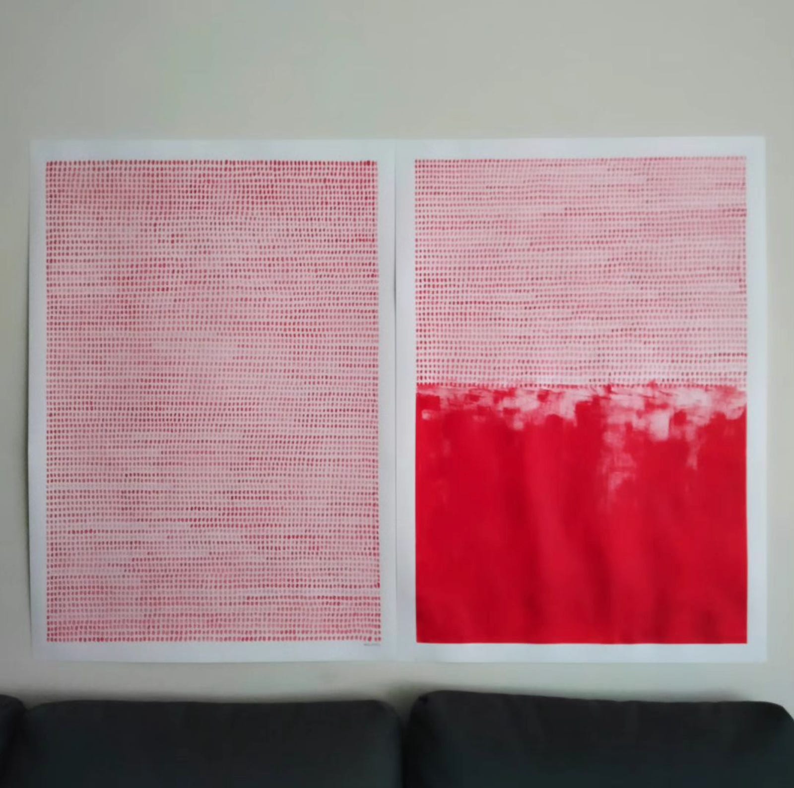
Visualization doesn’t have to be created solely by Data Visualization designers. I have been a fan of Marta Nunes’ illustrations for years. She does simple, almost monochromatic illustrations which often tackle teams like freedom and Portuguese identity. In late October, she shared a striking visualization of the more than eight thousand palestinian lives lost so far during the Israeli siege of the Gaza Strip. It blew my mind. Like in her illustrations, Marta managed to convey a heartbreak and misery in simplicity.
Rita
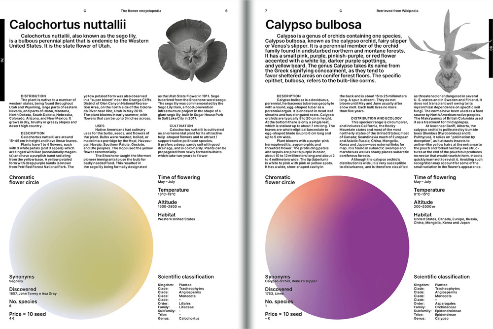
Encyclopedias can be considered boring for some, but not this one. The Flower Gang developed “The flower encyclopedia” and with it an engaging way to showcase an encyclopedia! It is a collection of data about flowers, focusing on their color and size to convey information in a different way. Along with the species description, you can find great visualization examples of showing flowers’ color, diameter, habitat, ideal temperature and time of flowering data.

Accessibility and DataViz
How to use color more consciously? - Part 2
Over the next few months, we will give you small tips on how to make your visualizations more accessible.
(If you haven't seen the previous editions, start by reading a little more about Accessibility and see the past tips here).
This month, we will continue to talk about Color. After addressing categorical scales, we now introduce you to some best practices regarding sequential and divergent color scales.
Sequential scales - less is more
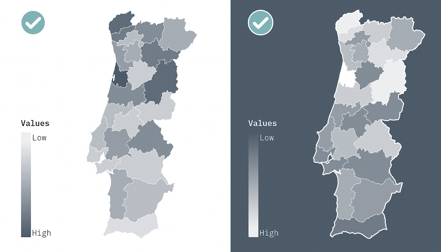
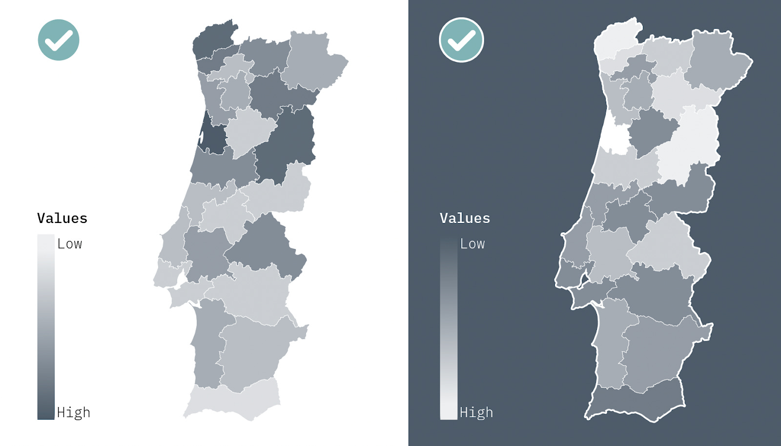
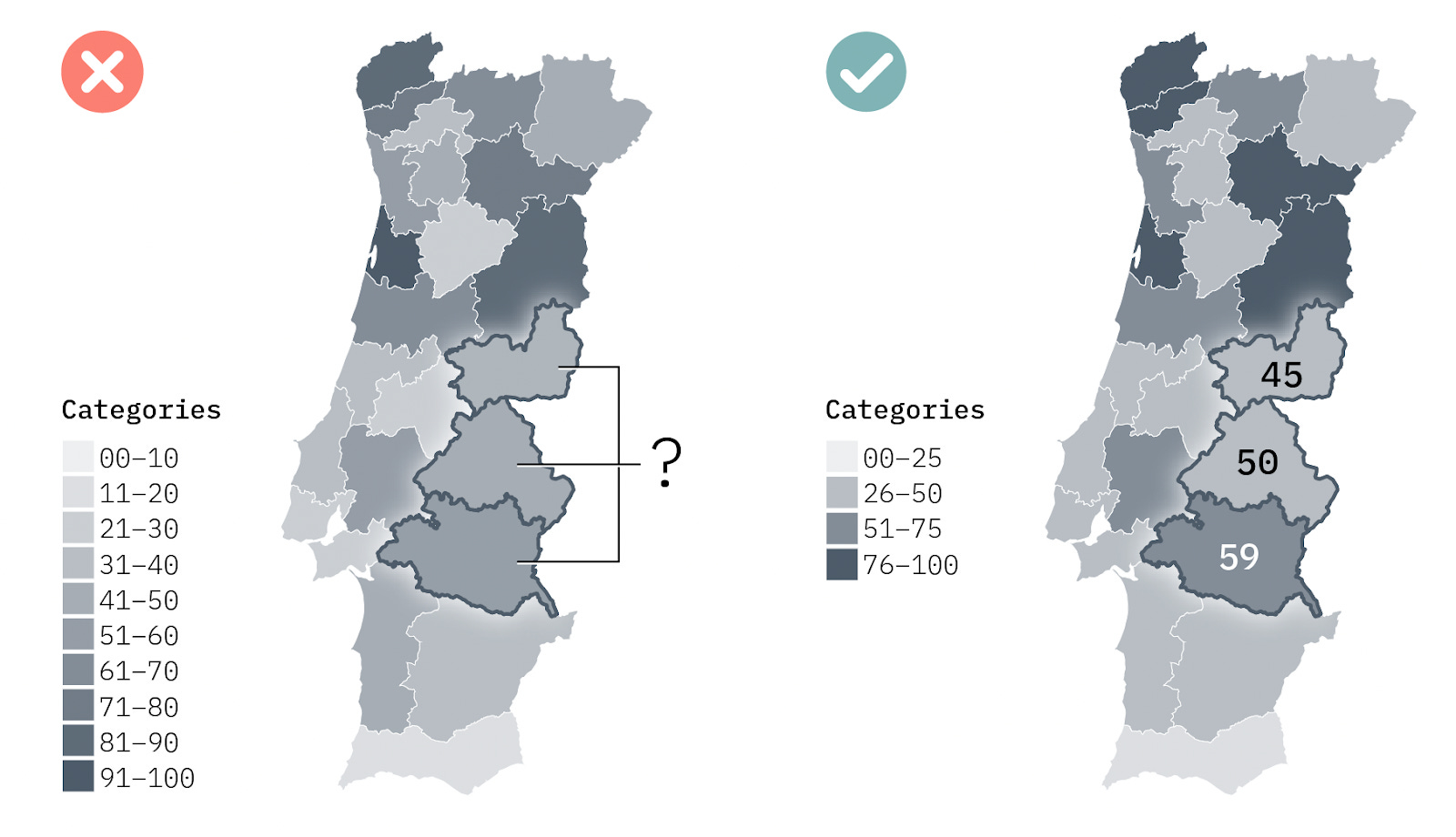
These scales are very useful for visualizing quantitative variables on maps and heatmaps - darker colors indicate higher values. If the background of the page is dark, the highest value should have the lighter color for increased contrast.
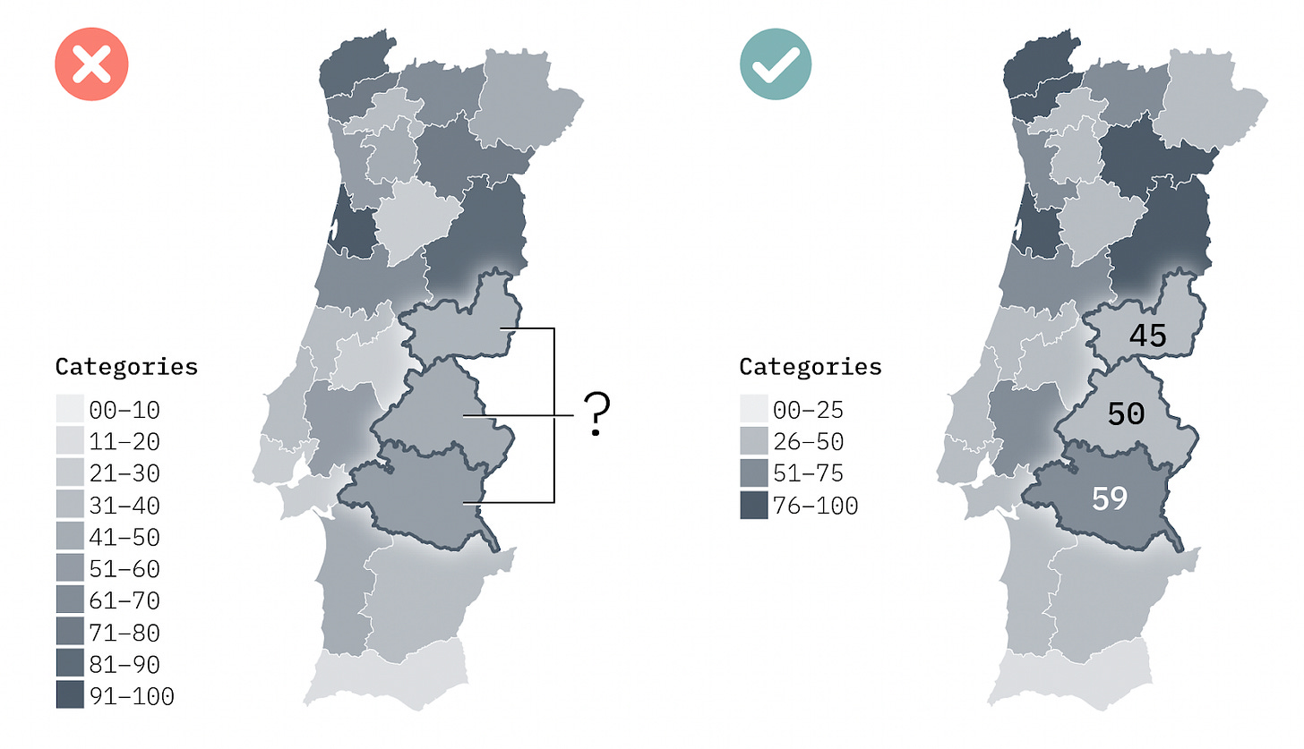
Unlike large views with many values, where we aim to appreciate a pattern and not know the exact value of each area, in smaller views it is preferable to have no more than 3-4 levels of brightness. Otherwise, it becomes difficult to distinguish between categories. You can overcome this by grouping some of the brightness categories and/or using direct labeling.
Diverging color scales
These scales are used when there is a clear average value (zero or a target), or when we want to emphasize very high or very low values in opposing categories - for example, when discussing positive or negative values, results of bipartisan elections, like in the USA, or even temperature values in visualizations about climate change. There is a clearer intermediate value, and then each extreme has a progressively darker color.
The pair of colors used in diverging scales must be carefully chosen to avoid problems for users with color blindness or in black and white versions. We will talk a little more about this in the next two editions of the newsletter.
To finish, we leave you with two tools:
Chroma.js Color Palette Helper, created by Gregor Aisch, which will help you create sequential and divergent color scales, automatically making small corrections to the saturation and luminosity of each category to ensure a more effective visualization.
Color Brewer, created by Pennsylvania State University specifically for cartography, which will also help you create color scales.
Follow us over the next few months to learn more about accessibility and data visualization. Write to us if you have any questions or relevant experiences on this topic that you would like to share.
If you enjoy our Pastel de Dados, do not hesitate to share it so that others can also enjoy it. See you next month!